Monday, 23 May 2016
Monday, 9 May 2016
Software Research
Software Research
For my software research, I went over to artstation and researched four different knife artists, and the software that they used.
Jason Poland is a third-year university student studying Computer Games Design. Jason focuses on 3D environments for games especially fantasy/dark fantasy themes, but also enjoys creating weapons like knives. He's also interested in level design/layout for multiplayer purposes and creating fun/fair levels for players. In the process of making Jason's knife, he used 3DS Max to model and render, Photoshop to create the textures, and xNormal to create the bump-mapping. I like this model because it's very simple, but still looks extremely realistic and professional. The textures are high definition and it is very well modelled. However, the colours are bland and doesn't stand out to the viewer. The way he added a bumpmap into the handle has intrigued me - I could interpret this idea into my own.
Florian Heutzenroeder is a self taught real-time 3D artist, mostly focusing on hard surface props and environments. For his model, he used Blender to model, Substance Painter for the textures, and Marmoset to render. This knife is possibly one of my favourite due to the sheer realism of the lighting - the second image is an up close image of the knife and looks very well structured and realistic, due to the render and lighting quality. This artist has made high quality textures, which adds an extra level of realism, as well as a slight bumpmap on each segment of the knife - if the light was to shine across the blade, the bumps in the knife would appear. The colour are definitely an improvement from the first knife but I get a slight cartoon-y vibe from it all - personally, I think the first knife has more detailed textures than this one.
Den Ovsyannikov is an artist on artstation who has not yet provided a summary about himself but his work is still presented well enough for me to understand his ideas and workflows. According to his page, he used 3D coat to model, Substance Painter to texture and Blender to render. Once again, this knife is definitely a possible favourite and is most likely where I'm gathering my inspiration from in the future. The way he completely disregards the bland colours and finishes it off with a solid black colour is very intriguing to me - the whole knife seems to be made of metal, so perhaps adapting this idea to mine could end with interesting results. Shape wise and colour, this knife is definitely my favourite. What could be improved, however, is the texture detail and the bumpmapping- in my opinion, they all seem flavourless.
Finally, Piotr Mierzwa. Piotr has also not yet provided a summary on his artstation page, so information about himself is unknown. He does however, provide excellent work - specifically his combat knife. For the production, he seemed to use 3DS Max to model and render, Quixel to texture, and xNormal for the bumpmapping. Piotr's knife is undoubtedly a well sculpted knife, but it unfortunately isn't my favourite out of them all. The sheer quality of the rendering reflects the light in a way that makes it look very realistic.
As part of my Photoshop experiments, I decided to look into different sky textures on Google so I could take inspiration from them. After experimenting on Photoshop, I created the four textures shown above.
The first texture simply shows a cyan-blue background with a few clouds spread across - personally, I think this texture suits the environment and lighting of my scene, due to its natural colour and personality. However, the colours could be considered quite dull - it would probably need more vibrant colours to match my scene perfectly.
The second texture is slightly similar to the first texture, however I've darkened the background to create a night setting. I've also created less clouds to show the night sky better, and incorporated a spread of stars to add an extra level of realism. Once again, this experiment could be considered dull with fairly bland colours. I could consider increasing the contrast of the colours to get realistic and professional looking skies.
For the third texture, I've experimented with a completely different setting; instead of using clouds, I've incorporated some northern lights and spread it across the setting. I've also thrown in some stars to accompany the night sky. This however, doesn't really fit the environment and feel of my scene.
Lastly, the fourth texture is my personal favourite due to its sheer simplicity and realism. For the background, I've mixed a sky blue with a crystal blue to create a gradient, and created a sun to change the mood of the texture. For the clouds, I've thrown in some generic white clouds to express the mood and feel of the texture. There's nothing really to improve on this one and the colours as a whole are perfect and match my scene appropriately.
Wednesday, 4 May 2016
Throughout the process of this experimentation, I took the time to model each and every individual piece of the car, such as the wheels, doors, headlights etc. I encountered numerous problems during the process of creating this, for example, the tutorial was sped-up, so I found it difficult to understand what the artist was doing. I encountered this problem however, through patience.
To do this, I imported a solid plane image of the Audi R8 in its side view orientation. As you can clearly see, all I would have to do is follow the individual lines with shapes. This is exactly what I did but with polygon planes. I followed the individual lines of the car to create different assets, such as the window frame, door etc. The image shows me working on the window frame so it accurately matches the image behind it.
I did the same for every single part of the car on the right half, so it can be mirrored over afterwards.
I did this until I had the entire right side of the car in shape and accurate to the original model. The image below shows this.
To complete the car, I'd need to mirror the geometry on its correct axis so it almost reflects this part of the car, thus making it complete.
To mirror the car on its correct axis, I clicked 'Mesh', and then the little box next to 'Mirror Geometry'.
After the settings window popped up, I looked at the axis that the car was orientated on - in this case, it was -X, so I changed the mirror direction to -X. I know this because, if the geometry was mirrored on the +X axis, it would mirror the car to the right, rather than to the left.
Obviously to the left is where we want it to be mirrored, so I finished my settings and clicked 'Mirror'.
After a few seconds, the car was completed and mirrored. This mirroring did however, have a few problems with it, such as an unusual line cutting down the middle. I fixed this problem by merging all of the vertexes until they were perfectly joined.
After minor fixing from the mirrored geometry process, I decided to finish up on extra details on the car, such as the Audi logo on the front and back of the car, the license plate, and the wheels.
For the Audi logo, the process was very simple. I created one ring using the polygon tools, selected it, and clicked 'Edit Mesh'. From the drop-down menu, I clicked 'duplicate' which allowed me to move each ring into position, resulting in an accurate depiction of the official Audi logo. No general problems with this as I was working with very basic shapes and basic tools.
Tuesday, 19 April 2016
Unit 9
Communication and Presentation survey.
This survey is to help you to understand the ways that you
have communicated on this course. This will show us what you think of these
ways of communicating and if we need to change anything in the coming
years. You can let us know what the
advantages and disadvantages of these were.
Please answer each question as fully as possible.
Verbal
presentation skills - In what ways have you verbally communicated your projects or
ideas during this year?
Group discussion around a table between peers, where we discussed our
ideas and received feedback afterwards.
What were the
difficulties in communicating in this way?
Trying to describe my ideas as best as possible to receive the best
feedback I can.
What were the advantages?
I was able to receive honest and accurate feedback from my peers and
tutor relating to my ideas so I could develop from them.
How do you think using these skills will help you in the
future when furthering your education or going into employment?
The skills I’ve gained from verbally communicating with my peers allow me
to easily describe my work in a way to receive the best feedback that I can, so
that I can start the development of my project.
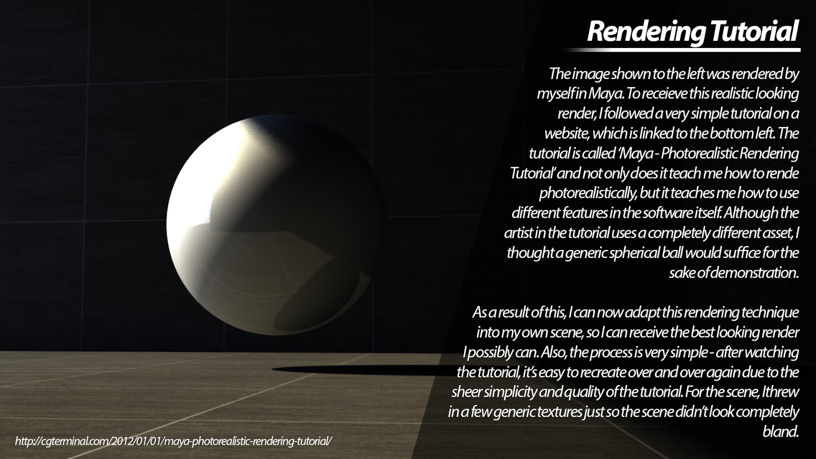
Visual presentation skills - In what ways have you visually communicated your ideas
throughout your project?
I’ve prepared my work on my blog and allowed other peers to sit at my
computer and check out my work, whilst giving positive and constructive
criticism.
What were the difficulties?
The difficulties in this were that I had to neatly present my work in
order so it was easy for the viewer to give feedback on; I also had to choose
certain pieces of work depending on what I wanted them to see.
What were the advantages?
This allowed me to collect more feedback from my peers so I could
progress and develop my ideas.
How do you think using these skills will help you in the
future when furthering your education or going into employment?
The skills I've gained from visually communicating with my peers allow me
to see the advantages and disadvantages of a piece of work, so I can give
feedback on it.
Final exhibition - How do you plan to show your work at the final exhibition?
I plan to show my work at the final exhibition by setting out the development
of my project from day one; I will firstly show my initial ideas, and will
develop from there.
What other ways can you communicate to the exhibition
visitors who you are as a games student/artist so that they understand who you
are?
I have created a personalised business card on Photoshop based on myself
and my project.
How do you think using these skills will help you in the
future when furthering your education or going into employment?
These skills will allow me to use basic presentation skills in a work environment
in front of colleagues/peers.
Wednesday, 13 April 2016
For this document, I've sketched out three different knife shapes so I could get a rough idea of the shape of it so I can develop from there. I've also annotated the different features of each knife and spoken about my ideas regarding them all.
Sketches
For this sketch, my mind was set on tropical related environments, so I recreated Maya Bay in the Phi Phi Islands and drew the large rocks in the background for added effect. I then proceeded to sketch a knife (not finalised version) into the sand. Other features in the sketch include the ocean and waves, making the sketch more realistic. This sketch is one of the competitors but at this point, I was looking for something more basic/realistic.
For this sketch, I took into account my initial thoughts for this project and sketched it onto Photoshop. The end result is as shown above, which reflects my initial thoughts very well. I also took into account my recreation of the Far Cry 3 poster and sketched down my ideal setting. I included large sand hills in the background, along with wind physics to the leather strap, making it look more realistic. This is still my favourite idea as it reflects my initial thought process at the start of the project period.
For the final sketch, I decided to experiment with other environments. Immediately, my thought process was set on trees, so I sketched down a forest environment, with the knife standing up in the dirty, very much like the previous two sketches. The sketch contains very few features, but is still an idea regardless - I included a rough dirt terrain and lowered the wind physics on the leather strap. This idea could possibly be improved more but didn't appeal to me in the slightest, so I decided to look at our other two sketches...
After discussing my plans with my peers and tutors, I ended up planning my scene on the desert environment, purely because of the simplicity and realism of the idea. I will base my ideas and development up on the picture shown to the left - I will recreate, model, texture and render the image to my desired standard, and so it fits the merit criteria.
Tuesday, 12 April 2016
Mindmap
Here I've set out and labelled my rough ideas of the project so far. As you can see, I've labelled, the different types of knives, such as a bayonet, flip knife, machete, throwing knife etc. I've also labelled the different types of materials, specifically for the handle or for possible straps hanging from the knife. As well as this, I've labelled the different sizes and shapes for the knife to rule out unwanted ideas. For example, should the knife be big or small? Futuristic or vintage? These ideas are definitely something to take note of when drawing my ideas and actually creating the knife itself. In addition to this, I've written a few ideas involving the history of knives in general. For example, could the knife come from the Cavemen Era? The Egyptian Era? The Qijia Culture? These ideas could spawn a unique idea during the process so it's good to write down these things.
Reference Images
![]() |
| These are images of a beach that I personally captured in the Isle of Wight. They show in full detail the sand and the sky, which will serve as inspiration for when I go to model and texture in Maya. |
![]() |
| Knife Diagram |
Research on Knives
Knives are small yet dangerous weapons usually very sharp at
the tip of the blade. It consists of a handle, and the blade itself, however
knives used in the military have specific names, as they can hold gadgets and
tools. The typical kitchen knife, however, simply consists of a handle and a
blade. Knives go back thousands of years to the Egyptian era, when simple men
forged simple weaponry, ultimately creating a sharp blade to hunt with. Over
years, they have changed massively in shape, size, and threat, with the newer
military knives capable of penetrating human bone and slicing through raw
flesh. Although knives are simple weapons, they are commonly used in gang,
urban and modern warfare as a form of sidearm – they are typically used in
close combat, however highly trained users are capable of throwing them
accurately at a target. Knives have been a massive part of previous world wars,
such as World War 1 and 2, where it was clipped onto the end of rifles,
commonly the M1917 Enfield. They called this a ‘bayonet’. They produced these
through the 1910s to the 1930s, and then produced again in the 1960s.
Subscribe to:
Comments (Atom)


